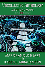
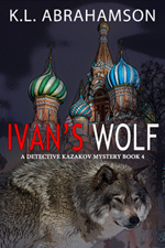
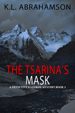
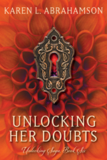
I’ve recently updated the covers of this six book series with the outstanding covers designed by WMG Publisher and graphic artist Allyson Longueira. The covers were launched October 1st! Thanks Allyson for such fantastic work! What do you think?
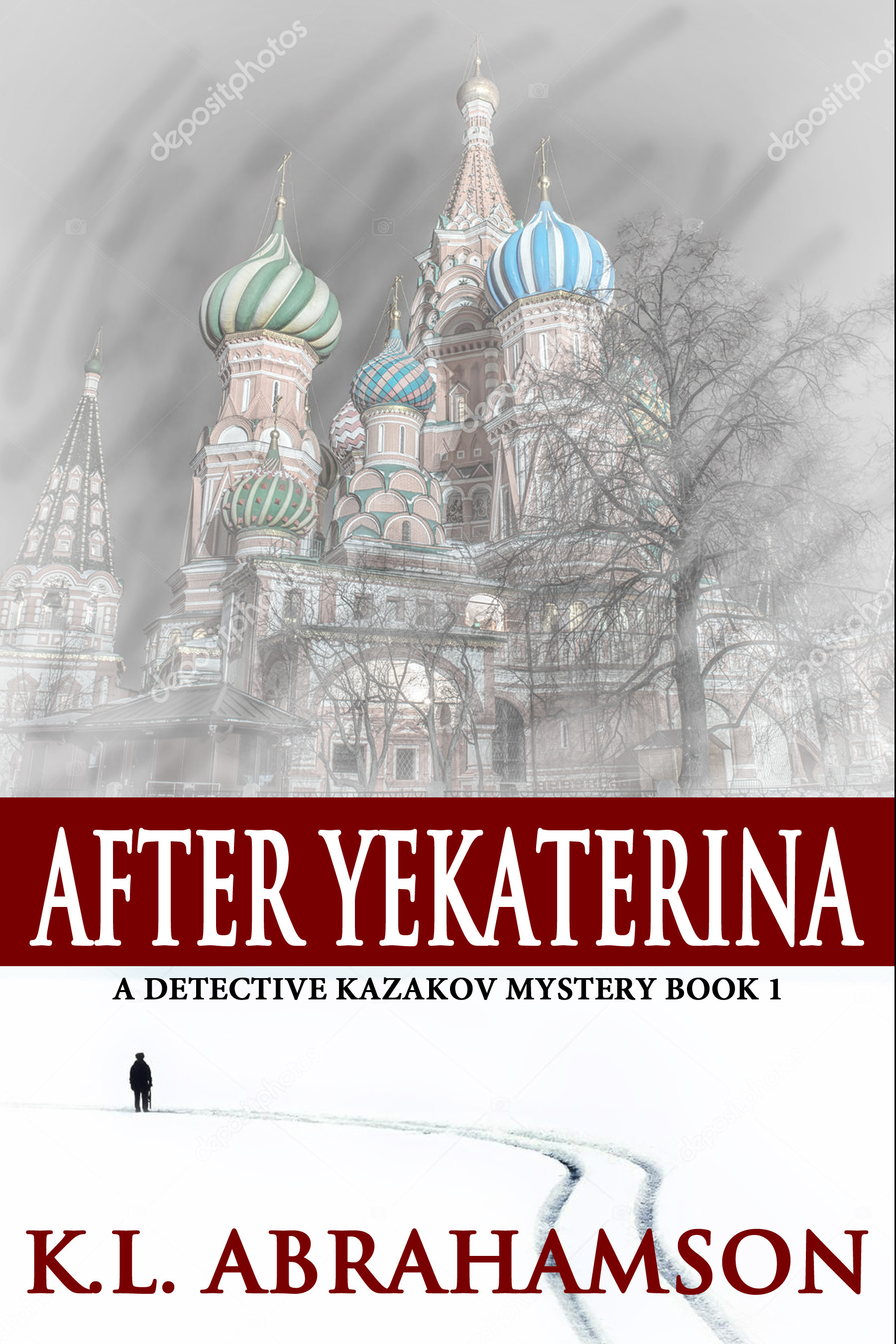
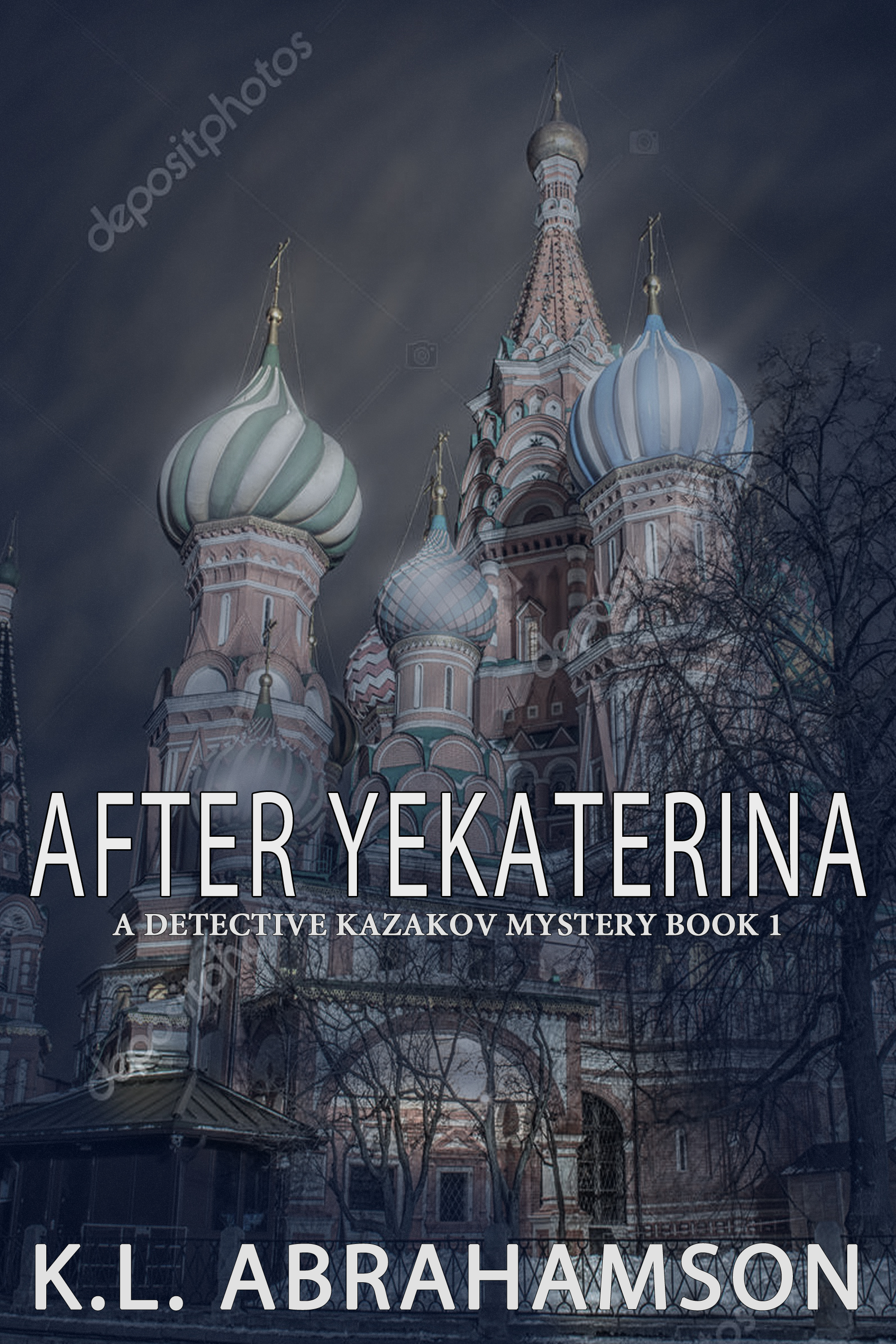
I seem to be having trouble with novel covers these days. I’ve struggled over a romance series that will be getting a rebranding this Spring (after going through the same thing last Spring—I’m still not happy.) Now I’m working on the cover for the first in a new alternate history mystery series. The first novel, After Yekaterina, is in for copy editing and I’m about 45% of the way through the first draft of the second novel, so I thought I’d get started with planning covers.
The books are noir police procedurals that take place in an alternate world where the Ottoman Empire defeated Catherine the Great of Russia. As a result the Ottomans kept their hold on central Asia—until they bumped up against the Chinese Empire of the Sun. In this world, the rag-tag remains of Russian Moscow have built a new motherland, Fergana, with New Moscow as their capital. Caught like the gristle in a joint between the two superpowers, Fergana provides fertile ground for a new Asian Great Game of spies and subterfuge. It takes lone wolf Detektiv Alexander Kazakov to deal with the bodies left behind.
I have two cover options below. One represents the loner working alone, while the other focuses on place and tone. What do you think? Which one best represents the concept I’ve laid out?
The Miscellaneous File: What else you can do to get your books to market?
To recap this series to date, I’ve talked about blogs and a little about reviews. We’ve heard about using social media with the caution that none of these should take time away from your writing, and we’ve also discussed books and branding and getting ready for the market. Sounds like we we’ve covered a lot, but there are still a few other things that an indie publisher can do to help get their books to market. That’s what this blog is about.
First of all, I’m going to say that although e-books seem the major way authors/indie publishers are going to get their books to readers, they should not forget the opportunity to create print publications. I refer you to my blog HERE, for options about Print on Demand (POD), and just to recap, it is not that difficult to create a print book if you are prepared to learn the software to do it.
So first let’s talk about some of the other no-cost/low-cost things you can do to encourage people to buy your e-books:
1. Write good books. I know this seems self-evident, but writing good books and writing lots of them is a critical way to become known. Think about it as in terms of the laws of chance. If you have one book up online there is far less chance that people will discover you, than if you have ten or fifteen. So focusing on writing good books for your market (under one name—for each pseudonym you need to do the same) is a critical piece of your marketing.
This cover of a soon-to-be-released urban fantasy features the fantastic photography of an up-and-coming young photographer.
2. Create good covers. This means studying the covers of best sellers in your genre and picking out the things that you think will sell your book. It means finding strong images for your covers because these are the first things that prospective readers see.
3. Write good blurbs/back cover copy. This is the second thing that readers see about your book. Is it interesting? Is it active? Does it raise a question a potential reader might want answered?
4. Within your e-book whether short story or novel, include links to other writing you have for sale. This can be as simple as listing other stories/novels available for sale. It would be better if you included links in the story that will take the reader directly to the other story/novel, so that the reader has the fewest number of clicks necessary to purchase your other material.
5. Include excerpts. This is something I am just starting to do. This means including the first chapter or two of another, similar novel/story, so that the reader can sample it. Hopefully you have good openings and the reader will come to the end of the sample and want to read on. There’s where you insert the link(s) to where the reader can purchase the other book.
6. Loss leaders. If you have short stories that either include the characters in your novel , or are in a similar vein to your novel (e.g. same world, or genre), you can try putting the short story up for free with the free excerpt to the novel attached. A number of friends are finding good success with this. Similarly, if you are writing a series and have the second or third (or fourth etc.) novel coming out, you can sell the first novel in the series at a cheaper price for a limited time.
7. Free Fiction on your website. You can also put short stories like loss leaders up on your website to encourage people to come and read, and then purchase other writing through links on your website.
8. Book cards. (okay, this involves some upfront money, but I still thought I’d include it.) This is a relatively new idea that hasn’t been put in place too much yet, but it involves having gift cards printed for your book and packaged in such a way that they can be sold in book stores. A Canadian company is experimenting with this as are a couple of professional writers I know. These cards can also serve as loss leaders that could be sent to book bloggers or reviewers, or they could be given for free at conferences, or they could be marketed in books stores.
So those are some of the things you can do to market e-books. For POD there are another few options, but these options generally require you to have more than a few books available.
1. Create advertisements for books. If any of you have been at Science Fiction conventions, you’ll recall how there are tables with fliers about upcoming or available books. You can do this too, by emulating book advertisements in magazines or publisher’s catalogues. If you have mastered the process of creating a book for POD, you can certainly create a book flier. These can be distributed at conferences or other book fair events you attend.
An example of a brochure for the novel Afterburn
2. Use your local libraries. Often libraries like to support local writers. Approach them about ordering your books. Alternatively offer to donate some.
3. Take advantage of opportunities at conferences etc. to sell your books and promote yourself. If there are opportunities to sell your books then make copies available for sale. Have fliers of your soon-to-be-available books to pique people’s interest. Get on speaker’s lists to talk about your books or related topics and be gracious and interesting when you talk.
4. Approach local bookstores to determine their interest in local authors. I know of at least one local chain that has a policy of supporting local writers and carrying their books. Make sure they know about your work. Take them samples. Which brings to me the biggy:
5. Create a publisher’s catalogue of work available. This includes all the books available from your indie publishing company. Usually this should be at least ten different novels and anthologies. (Remember, you can create anthologies from your short stories, including the freebies.) This means that you create a full color booklet that can be distributed to bookstores locally or even farther afield either through hand delivery or mail out. The big thing here, like with covers, is to ensure your catalogue is professional looking and clearly spells out how and where to find your in-print books.
So those are some options for indie publishers to market their books, whether e-books or print. I haven’t tried them all, but I’m working on it. So what other strategies have you tried and how have they worked for you?
This morning I happened to talk to a reader of one of the Karen L. McKee books called Judas Kiss. The reader told me she had had difficulty reading the book; it might have been the fact that she was in hospital at the time, but when she got home she picked up the book and still had trouble. When I asked her what stopped her there was no hesitation: The cover. She described it as too dark, and though the book is a romantic suspense, to her the black, white and red cover said this book was horror.
Not what I was going for.
So I decided to get in touch with one of my cover-designing, author friends, Pati Nagle, and ask her a few questions about how to design a proper cover.
1. Are there specific design elements, like title fonts and placement authors should think about as we design covers?
Pati suggests that a good rule of thumb is to use only one or two fonts on a cover. Critical to this is make sure the text is legible even in small (thumbnail) size. This means that if you are using an ornate font, you need to check whether it is readable in the size cover that will come up on Amazon or Smashwords or Barnes and Noble.
Pati also says that generally the title and author go at the top and bottom, or both, leaving the centre for the main image.
2. Are there guidelines regarding using too many or too few images on a cover?
Pati suggests that we should keep it simple as too many images will confuse the reader.
From my experience, when a reader looks at a book, the cover is generally designed with one or two strong images that the reader’s eye moves back and forth over. My experience as a photographer says that too many images make the reader’s eye keep bouncing from image to image and never really come to rest so the cover never really gains a focus for the reader. As a result, they don’t know where to look.
3. How do we convey mood? For mystery? For Fantasy? Horror? Etc.
The best way to really understand book covers for each genre is to study recently published books to see what the genre is doing. You can decide then, whether to follow their lead. This holds true especially for bestsellers.
4. How do we judge when a cover is too dark or too light?
If it’s readable, it’s fine. That usually means there must be sufficient contrast between the image and the text.
5. Are there specific graphic design elements to keep in mind?
The 1/3/9 guideline. The placement on the page does not have to be in exactly this position.
In graphic design there is a 1/3/9 rule for division of a picture. They can be in any order (meaning you can change placement around the cover).
When designing your cover, create a graphic image with cover dimensions and three bands of those proportions, and compare it to your cover. See if the title/author name and main image are in the 3 and 9 proportions. The 1 proportion can be a secondary image or a blurb. This isn’t an absolute rule, but it’s a good guideline.
6. What is a good process to use to come out with a reasonable cover?
Select a cover image and choose a font for the title and author. Lay those out on the page. Then tweak the text color for contrast and at the same time harmonize it with the other colors. Add a blurb or subtitle last.
When choosing the cover image, consider using elements from the book as that will please the author and the readers. Iconic images are best: things that will immediately raise an idea in the viewer’s mind. If the cover concept is complicated to describe, it probably won’t read well on a cover.
7. Are there specific programs you recommend for developing a cover?
A good graphics program that will let you build a layered image. Many people use Photoshop.
A couple of other points to consider come from readers I’ve spoken to and my own experience:
A cover with a photograph may not go over as well as something more artistic or illustrative.
For authors who can’t afford Photoshop or something like it, covers have been successfully developed using only PowerPoint.
When positioning a picture on the page, consider the strongest elements and where they should be to draw the reader’s eye. Photographers know the rule of thirds – that each picture can be divided into thirds horizontally and vertically. The best place to put major elements is near where those horizontal and vertical lines intersect, because that is where a viewer’s eye naturally goes.
Finally, always consider what image will sell. By this I mean, what image has the best chance of getting people’s attention. Case in point are the two covers here. The one with the feather was my first cover. Then I realized that stories with dragons on the cover (and this story actually has one) probably sell better. Well duh!
So cover two came into being. That’s the nice thing about this electronic world- we can try things out and find what works.
Just remember, these are design guidelines, not rules. So keeping all these thoughts in mind, what are some of your favorite covers and how do they meet these guidelines—or not.
Color 1
And to keep my reader happy, I’m considering changing the color of Judas Kiss. What do you think? Which one would you choose?
Angelina Jolie has her Bardot lips, while Jennifer Aniston has her girl-next-door appeal. You pick up a James Patterson novel and you can tell it’s a thriller, while Urban Fantasy has a leather-clad woman on the cover. Each of these are examples of having a look, or a trademark, whether of a person, a novelist or a genre. For indie publishers, you need to consider what is the ‘look’ of your books.
Part of your look will depend on what type of book you are publishing, because each genre seems to have style conventions. I mentioned the urban fantasy trope of the leather clad woman, and the cliché for romance is the bare-chested hero rescuing the damsel in distress (thankfully this isn’t the case anymore), but establishing a look for your books is more than the cover art.
Why is this important? Because readers come to recognize books with a similar look and if they liked the last one they read, they are more likely to pick up the next. While readers often don’t pay attention to who the publisher is, they know when the books have a similar look. They also come to expect certain authors to have a certain look to their books. As a result, when a Publisher goes through a rebranding of an author, there is often confusion for readers about which book of that author they have read. How many times have I picked up a book thinking it was a new title by a favored author, only to find it was one I’d read, but released in a different cover. Readers remember covers and are attracted to them. Thus we need to use covers to convey who we (the book and the author) are.
To talk about Branding I thought it might be best to look at some examples of books recently put out by indie publishing authors:
Spirit Dance is an award winning fantasy from Canadian Author Douglas Smith. He has been published through Lucky Bat Books, an independent e-publisher. Smith’s Books have been packaged with a similar look that any reader would recognize. Each of them have the Author’s name in large print at the bottom of the cover, with the title in relatively small print in a narrow black strip across the waist of the cover. This strip acts either as a division between two related images, or as a division in the one main picture. Alternatively the covers have a very simple, single image that conveys a feeling about the books’ content. Most of the covers also use photographs rather than illustrations and all have an other-worldly feel about them, which is good given that Smith is known for his fantasy writing. This use of the specific graphic elements – the title band, the faded-towards-transparent author name, and the same placement of any award notifications on the covers all provide a combination of easily recognizable cues that this is a ‘Smith book’.
Eternally Grounded is a fantasy story from Camden Park Press. Camden Park publishes across a number of genres including fantasy and science fiction, but all of the books have something in common, namely the italicized logo, Camden Park Press, somewhere on the cover, so you always know you are getting a book from that publisher. In the best of worlds, there would be consistency of placement of the logo as well, but design sometimes requires this type of thing be moved. Structurally, within the Camden Park family of books, those by Elizabeth Ann Pierce also have a commonality of the author’s name being set off in a neutral band at the bottom. If used in all the Pierce books that can become an easily recognizable standard for this author.
Downhill Rush is one title in a line of books from Fiero Press. Terri Darling is one of the authors who specializes in romance. If you look at the cover, the publisher has passed on a logo, but has used layout and color to show a common line of books. In this instance most of the Terri Darling books have a valentine-red border at the top with the author’s name and the tag line “Where the action is hot and the romance is hotter”, in a consistent, easy to read font that puts the author front and center . Does the tag line sound a little sexy and a lot hot? Does it tell a reader what they’ve got? With this memorable little tag line and the familiar look of these books, it won’t be a surprise if these books sell well once the author is established.
The Nara Effect is a Science Fiction book from Matthew Lieber Buchman. Matt has a line of books that cross genres, but there is a similar look to most of them, so you know you have a Buchman book. Across the books, the covers have a consistent upper and lower border with a consistent placement of the Author’s name and title. The central cover art section of the cover often uses a montage of images out of the book and the blurb usually is placed right at the top. Again the reader is going to know they have a Buchman book, and just to be certain of that, on the back of each novel Buchman has placed a knife, a Samurai Sword or some other sharp-bladed object diagonally across the back cover blurb. This is unique and memorable and I can see people describing them as ‘the knife book brand’.
The last of the books I’m examining comes from best-selling e-book Thriller author, Joshua Graham. His cover for Beyond Justice follows the tropes of many thrillers. It has the emphasis on name of a ‘big name’, best-selling author. It has the black band at the top for the author’s name to stand out in and the cover image is clean and simple with this cover focused on the primary character. This similar layout is present in many of his other publications, but the focus here is on NAME. He has made himself a brand, just as Clive Cussler, and James Patterson have made themselves brands, though not at their level yet.
So the look or brand is layout and font and logo and feel. This means that in establishing your brand it’s helpful to:
Chose something that you can present consistently on the cover of your books. This could be a logo, a tag line or even the name of the Author.
Consider whether your approach is to have a collage of images or a single strong image. This can be used consistently across all your books so that your Brand either has complex or minimalist covers, both of which are used in ‘traditional’ publishing.
Be consistent in format. If you are using bands of text, use the same type of band across all your books. If you use a specific font for your books and a brand is important, use that font consistently. If you are going to include a tag line or logo, position them consistently on the cover.
Think about whether color can be used to show consistent branding.
Think about how you are trying to position yourself or your books and your genre. If you are writing/publishing big thrillers, then use a thriller format for the covers. If you are writing/publishing epic fantasy, it will be something totally different, than if you are writing/publishing sweet romance. So go study the covers in your genre and see what you can come up with as cues for readers regarding your brand.
So creating a brand can include combinations of graphic elements that build a ‘look’. When you are creating your brand, try out various combinations to see what works best.
I’d be interested in seeing or hearing about what others are doing to establish their brand of books. Now I’d better go do some branding of my own.


")