Cover Design: What is your favorite book cover?
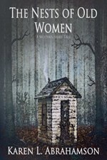
") This morning I happened to talk to a reader of one of the Karen L. McKee books called Judas Kiss. The reader told me she had had difficulty reading the book; it might have been the fact that she was in hospital at the time, but when she got home she picked up the book and still had trouble. When I asked her what stopped her there was no hesitation: The cover. She described it as too dark, and though the book is a romantic suspense, to her the black, white and red cover said this book was horror.
This morning I happened to talk to a reader of one of the Karen L. McKee books called Judas Kiss. The reader told me she had had difficulty reading the book; it might have been the fact that she was in hospital at the time, but when she got home she picked up the book and still had trouble. When I asked her what stopped her there was no hesitation: The cover. She described it as too dark, and though the book is a romantic suspense, to her the black, white and red cover said this book was horror.
Not what I was going for.
So I decided to get in touch with one of my cover-designing, author friends, Pati Nagle, and ask her a few questions about how to design a proper cover.
1. Are there specific design elements, like title fonts and placement authors should think about as we design covers?
Pati suggests that a good rule of thumb is to use only one or two fonts on a cover. Critical to this is make sure the text is legible even in small (thumbnail) size. This means that if you are using an ornate font, you need to check whether it is readable in the size cover that will come up on Amazon or Smashwords or Barnes and Noble.
Pati also says that generally the title and author go at the top and bottom, or both, leaving the centre for the main image.
2. Are there guidelines regarding using too many or too few images on a cover?
Pati suggests that we should keep it simple as too many images will confuse the reader.
From my experience, when a reader looks at a book, the cover is generally designed with one or two strong images that the reader’s eye moves back and forth over. My experience as a photographer says that too many images make the reader’s eye keep bouncing from image to image and never really come to rest so the cover never really gains a focus for the reader. As a result, they don’t know where to look.
3. How do we convey mood? For mystery? For Fantasy? Horror? Etc.
The best way to really understand book covers for each genre is to study recently published books to see what the genre is doing. You can decide then, whether to follow their lead. This holds true especially for bestsellers.
4. How do we judge when a cover is too dark or too light?
If it’s readable, it’s fine. That usually means there must be sufficient contrast between the image and the text.
5. Are there specific graphic design elements to keep in mind?

In graphic design there is a 1/3/9 rule for division of a picture. They can be in any order (meaning you can change placement around the cover).
When designing your cover, create a graphic image with cover dimensions and three bands of those proportions, and compare it to your cover. See if the title/author name and main image are in the 3 and 9 proportions. The 1 proportion can be a secondary image or a blurb. This isn’t an absolute rule, but it’s a good guideline.
6. What is a good process to use to come out with a reasonable cover?
Select a cover image and choose a font for the title and author. Lay those out on the page. Then tweak the text color for contrast and at the same time harmonize it with the other colors. Add a blurb or subtitle last.
When choosing the cover image, consider using elements from the book as that will please the author and the readers. Iconic images are best: things that will immediately raise an idea in the viewer’s mind. If the cover concept is complicated to describe, it probably won’t read well on a cover.
7. Are there specific programs you recommend for developing a cover?
A good graphics program that will let you build a layered image. Many people use Photoshop.
A couple of other points to consider come from readers I’ve spoken to and my own experience:
- A cover with a photograph may not go over as well as something more artistic or illustrative.
- For authors who can’t afford Photoshop or something like it, covers have been successfully developed using only PowerPoint.
- When positioning a picture on the page, consider the strongest elements and where they should be to draw the reader’s eye. Photographers know the rule of thirds – that each picture can be divided into thirds horizontally and vertically. The best place to put major elements is near where those horizontal and vertical lines intersect, because that is where a viewer’s eye naturally goes.
 Finally, always consider what image will sell. By this I mean, what image has the best chance of getting people’s attention. Case in point are the two covers here. The one with the feather was my first cover. Then I realized that stories with dragons on the cover (and this story actually has one) probably sell better. Well duh!
 So cover two came into being. That’s the nice thing about this electronic world- we can try things out and find what works.
Just remember, these are design guidelines, not rules. So keeping all these thoughts in mind, what are some of your favorite covers and how do they meet these guidelines—or not.

And to keep my reader happy, I’m considering changing the color of Judas Kiss. What do you think? Which one would you choose?

- Color 2