Tag: Portolan charts

Maps, Highways, and Their Imprint on The World
Maps, Highways, and Their Imprint on The World

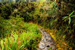
Path through the rain forest on the Camino Inca, Peru (2011) Photo (c) Karen Abrahamson

The ancient T.O. maps didn’t represent reality, but they did map the reality of the Christian spirit at the time. Portolan Charts gave a realistic representation of coastlines and the work of the Indian spy/cartographers, placed rivers on the maps well before aerial mapping existed.

One of the last bastions of ‘unmapped’ territory was the Amazon basin of Brazil. In 1799 Alexander von Humboldt, the son of a Prussian baron, spent five years travelling from Venezuela’s Orinoco river through the Amazon, collecting specimens and surveying. Afterwards he produced 33 volumes of maps and illustrations. That was the last mapping for over a hundred and fifty years except for the occasional scientific or rubber company exploration.

Until 1970.

That’s when the Brazilian government got the idea to construct a highway from the Atlantic Coast, across 5,000 kilometers (about 3,400 miles) of rainforest to the Peruvian border. The construction was a nightmare due to a dearth of maps. The rainforest had too many clouds and—gee, rain in a rainforest?—for aerial mapping to work. The result was construction following ground-based surveyors who were barely ahead of the bulldozers and this led to the construction having to cross the same river multiple times leading to enormous unforeseen costs.
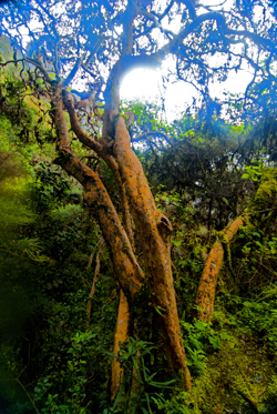
Cloud Forest tree along Camino Inca, Peru (2011) Photo (c) Karen Abrahamson

Enter the cartographers. In this case it was cartographers and the invention of side-looking radar (SLAR). SLAR is an improvement on the radar that helped safe Great Britain during the Battle of Britain. It’s the invention that allows radar to be shot out the side of an aircraft to take long horizontal pictures of the landscape. This technology can ‘see’ through clouds and trees to the landforms. With the help of computers, SLAR can provide accurate pictures of the rise and fall of the landscape.

The survey team with their aircraft arrived in Brazil on the summer of 1971. In just under a year SLAR mapped the Amazon in 32-kilometer-wide swaths which lead to the first detailed maps of the Amazon and an understanding that this huge territory wasn’t the previously-thought Amazon “basin”. Instead they found that only about 20% of the area was lowlands, with most of the landscape being hilly and mountainous.

This ‘sped up’ the construction of the highway which was completed in 2011 except for a single bridge in the Peruvian part of the road. But what has this meant for the area? For some, it replaces weeks of travel on dirt roads to a relatively short drive. For others it promises income from a potential huge influx of tourists. But what it also means is environmental degradation.

Brazil has a long history of environmental issues springing directly from road-building into this relatively delicate biosphere. Previous road building shows that almost 90% of deforestation lies within 50 kilometers of a road (about 23miles). Timber and mineral extraction are followed by hydroelectric dam development and the destruction this causes.

What’s disturbing is that the Amazon is truly the lungs of the world and cartography has provided the data needed to seriously damage those lungs. It places a different perspective on maps; one that undermines the beauty of what I’ve always thought and suggests the need for ethical standards that stand up to the push of corporate greed.
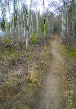
Path along the Yukon River. The quiet places like this are the ones lost in rampant development. (2010) Photo (c) Karen Abrahamson

There are means to ameliorate the potential destructiveness of developments like the Transoceanic Highway or the construction of pipelines like the proposed Northern Gateway pipeline through British Columbia, but it requires people like cartographers, citizens, and government officials to demand agreements that protect the environment BEFORE, planning starts. Otherwise ‘progress’ can just as easily lead to widespread destruction like what is happening in the Amazon.

The new maps of the Amazon not only map progress, but also the destruction of a reality. Unlike the T.O. maps of the Christians that cemented the Christian spirit firmly in Jerusalem, these maps not only mark destruction of biodiversity, but they record the destruction of the spirit of the indigenous people.
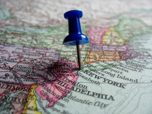
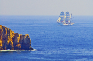


Faith, Maps and Portolan Charts

Faith, Maps and Portolan Charts

Okay, I’m anachronism. It’s Easter Sunday and so I’m writing about faith—well, a little bit of faith—faith and maps.

As I’ve said, I like maps and will continue to use them. Though many people are turning more and more to GPS systems in their vehicles, I still have my trusty book of street maps of the metropolitan area where I live. When I pull out my yellowing, dog-eared map book I’m reminded of the volumes of Portolan charts of old, that were the predecessors of the Mercator projection I spoke of HERE.

Portolan charts were mariner charts, used by sailors to navigate the Mediterranean and then the coasts of Africa and Asia. The earliest existing portolan chart dates from 1290, but records as early as 1270 talk of a captain pulling out charts to convince a frightened king that their ship really could reach land during a terrible storm. Portolan charts have distinctive features, most noticeably the rhumb lines and compass roses that gave sailors bearings to set their sailing headings. These rhumb lines set out the four cardinal directions and the principle wind directions (North, Northeast, East, Southeast, South, Southwest, West and Northwest) as well as the eight half-winds (NNE, ENE, etc.) Portolan maps also had detailed, careful place names along the coast, color coding of places to show importance, and standard ways of showing rocks and shoals, while overemphasizing bays and headlands—all important information for sailors trying to reach safe harbor. This is very different from the predecessor of the Portolan, the medieval mappamundi , which generally had East at the top, and Jerusalem at the centre without any detail. The mappamundi were there to represent a way of thinking for the faithful; all they really needed to know was the location of Jerusalem in relation to where they lived. By contrast, the portolan set out in detail the way to make your way in the world.

Yes, there were issues with the portolan charts. They used a rough scale, but had none of the accuracy the Mercator Projection provided. Still, they served their purpose.

No one knows who made the first portolan chart, but researchers have shown that those we know about were copied, some by tracing (they can tell by small pinpricks left in the vellum, and some by simple eyeballing). Portolan charts were also generally written on vellum—sheep or calf skin prepared in such a way that the narrow end of the beast (toward the neck) could fit the narrowing of the Mediterranean. The vellum could handle the rigors of sailing better than paper could and vellum could role up for easy storage or could be made into volumes of portolan charts. Of course, because they had different makers, different parts of the world were drawn using different scales which made it a challenge to draw up larger maps of the world.

But portolan fell out of use with the advent of the Mercator Projection because, while the portolan charts were good for the Mediterranean and coastal shorelines, they were not as good for great sea voyages where the Mercator Projection provided relatively easy ways to chart a route from places like South Africa to New York.

So the beautiful, utilitarian portolan chart fell out of use, just like my map book has fallen out of favor in comparison to those tiny black box GPS units and smart phones that help gadget users to get from point A to point B. To me, it feels like civilization has taken a great leap forward by stepping back. No longer are we worried about great sea voyages (Mercator maps), or even the details of where such and such a place sits along the coast in relation to where we are (Portolan charts). Now we simply input our destination and trust the GPS to tell us which headings to take, much like medieval civilization trusted their priests to tell them how to live in relation to Jerusalem. Which makes me wonder whether we might have stepped right back to the days of the mappamundi, where our sense of direction is directly related to our faith—but today it’s our faith in technology.

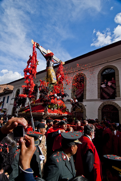
The Easter Procession in Cuzco, Peru. Flower petals are thrown whihc have, over time, stained the Christ figure black. (2010) Photo (c) Karen Abrahamson


Recent Fantasy

Available HERE,

$1.99

Available HERE,
$3.99

Available HERE $1.99


Recent Mystery


Available HERE
$4.99


Available HERE,

$4.99


Available HERE,

$4.99


Available HERE,
$4.99


Recent Romance

Available HERE, $2.99