Tag: Ptolemy

The Comet and the Cartographer
The Comet and the Cartographer

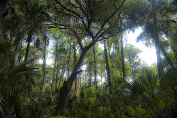
Cypress tree, Northern Everglades (2012) Photo (C) Karen Abrahamson

I’ve written earlier about the way maps are used to convey information about our world and how the information maps convey has extended far beyond the basic morphology, and the boundaries and formations humans place upon the earth. But how did the idea of using maps to present things like the distribution of population and average income come about?

The potential for such maps stretches right back to Ptolemy, but it was a certain Edmond Halley who made the first of what are known today as thematic maps. You see Halley, the same Halley who was a friend to Isaac Newton and who, in the 17th century, predicted the periodic return of a certain comet, also predicted that certain phenomena may be better presented as maps than through the use of words. He produced what is considered the first meteorological chart – of prevailing winds. He also published a map of the North and South Atlantic which showed variations of terrestrial magnetism by charting variations of the compass needle from true north. His map, created after two years of observations, charted these variations by using curved lines on a map that connected areas of equal value—a process that is used today, with isolines connecting areas on a map of similar elevation or depth.
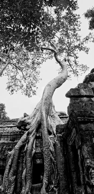
Fromage Tree, Angkor, Combodia (2009) Photo (c) Karen Abrahamson

The inspiration Halley provided led to the creation of maps in the 19th century that set out similar lines, isotherms, for temperature and isobars for barometric pressure. In the 19th century other means of conveying information beyond basic geography were also developed. For example, the use of larger or smaller circles to convey larger or smaller cities. Plotting of incidents of cholera and London water pumps on a map not only showed where the deaths occurred, but also demonstrated the use of maps as analytical investigative tools when all the deaths could be linked to a single water pump.

The development of thematic maps has continued, with odd maps called ‘winds of influence’ that group places of similarity such as use of technology, so that, in the 1980s, first-world countries were grouped closely together, while third world countries were separated by distance, illustrating how far behind some countries were. Maps of influence helped track and demonstrate the spread of botany across the South Pacific, and also gave clues to the spread of Polynesians over the Pacific.
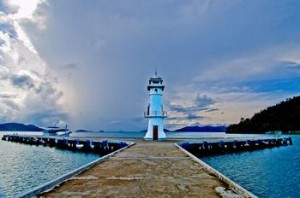
Lighthouse, Ko Chang, Thailand. (2009) Photo (c) Karen Abrahamson

So while Halley gifted us with the understanding that a comet returns periodically to our night skies, his greater gift might be the idea that maps can be so much more than representations of geography and international boundaries. Most of all, his use of isolines led to the bloom of maps as a means of showing the connections within our world.

 

In Search of a World Map

In Search of a World Map

This week I finished the second draft of book two in my post apocalyptic fantasy, Terra Incognita, series. It wasn’t easy because it required a fairly major rewrite of much of my major character’s attitudes and motivations because I hadn’t mapped my character out from book one to book three. As I get started on Book Three, I’m thinking about how the importance of a consistent road map across a series of books is just as important as a consistent map of the world.

My last post spoke of the work done to standardize measures in mapmaking that led to the creation of the scientific metric measuring system. But the creation of the metric system was only the start in a venture to create of a consistent set of maps of the world. This might not seem sexy, but think about traveling to a different locale and finding the maps you are using don’t use consistent measurements and contradict each other. You end doing a mass of translations to make the maps work or you might end up throwing the maps out because they are so inconsistent it’s easier to simply start from scratch. That was the situation for many explorers because the maps they had might have used a consistent measurement scale (but not always), but were also based on measurements started from different starting points. In other words the Prime Meridian had never been agreed upon.

The trail turns upwards (2011) Photo (c) Karen Abrahamson

After the agreement about the metric system, there were still disagreements in the cartographic world. One of the major ones was the position on the earth from which meridians (the imaginary lines drawn on the earth from pole to pole that connect all spots along the longitude) should be referenced – in other words where was the zero point on the globe from which all other distances would be measured. To this point in time, where measurements began depended upon the nationality of the scientist conducting the measurement.

The need for a Prime Meridian had existed for all Cartographers. Ptolemy had chosen the Fortunate Islands – at his time the westernmost extent of the world. But the age of politics had national sentiment taking precedent with the French recommending the zero point’s location in Paris, the Spanish recommending either Toledo or Cadiz, the Italian Pisa or Rome, and Americans wanting Washington or Philadelphia etc. It took the International Meridian Conference in 1884 to settle on Greenwich as the Prime Meridian which gave us our zero longitude, and also set our clocks and time zones with Greenwich Mean Time.

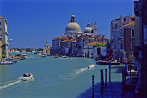
Venice's Grand Canal (2004) Photo (c) Karen Abrahamson

A later conference of the International Geographic Congress realized the mapping issues I mentioned above meant that there was a need to revise the world’s maps to create a consistent map of the world. It led to a proposal for an International Map of the World that would all be drawn to a single scale – 1:1,000,000 (1 centimeter =10 kilometers or 1 inch equals 15.78 miles) – leading to the name of the project being the Millionth Map. It would also be drawn using standardized symbols and colors. The project was debated for a period, but after examples of the maps were produced, in 1913 an agreement was reached. Maps were to be created for each 4 degrees of latitude and 6 degrees of longitude, not paying attention to national boundaries. All place names had to use the Roman alphabet.

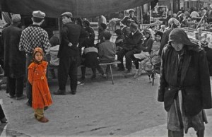
Little Uigher girl, Sunday Market, Kashgar, Western China (1997) Photo (c) Karen Abrahamson

It was a slow process. Between 1913 and the start of the First World War only eight maps were produced out of a total of 2,500 required to map the world. Between 1921 and 1946, the American Geological Survey produced the 107 maps that comprised the map of Hispanic American (North and South America). By the 1930s 405 maps had been produced in total, but the central repository of the maps (in Paris) was largely destroyed during the Second World War. In 1953, the United Nations assumed responsibility for oversight of the project, but by the 1980s only 800-1000 maps had been completed and many were not completed using exactly the same standards. Since then the U.N. has stopped even reporting on the project, so after all this work the Millionth Map languishes and who knows when you’ll fall right off its edges when you visit another country and have to work with maps that don’t mesh.

This suggests that I had better get busy and piece together the latitudes and longitudes of book three in my series, so that all of the books provide a complete and consistent picture of Terra’s world.


Recent Fantasy

Available HERE,

$1.99

Available HERE,
$3.99

Available HERE $1.99


Recent Mystery


Available HERE
$4.99


Available HERE,

$4.99


Available HERE,

$4.99


Available HERE,
$4.99


Recent Romance

Available HERE, $2.99