Tag: Reader Expectations

Great Expectations: Cats and Readers

Great Expectations: Cats and Readers

Kayaking the west coast. (1996) Photo (c) Karen Abrahamson

This past week I was supposed to be on the coast of Oregon with a group of writers learning about marketing books to bookstores. I was really looking forward to the trip and being with a group of great friends. I had everything packed and ready to be loaded into my car. My cats were primed and ready to for the trip. (They always travel with me, and the hotel where I stay at has known these boys since they were babies—it’s like a second home).

Then Ben, the larger of the two boys got sick and not just throwing up, but a total shut down. He quit eating (a VERY big thing for this guy) and drinking and became very quiet and cooperative. Now you have to know Ben. This is a cat that pulls paintings off walls and statues off shelves just to get your attention. When he took a downturn I ended up taking him to the emergency veterinarian. The next day more vets and more bills and at that point the I was still holding up hope that he might recover and I might still head to my course a day late.

Not to be.

Ben.

More tests, more bills and by this point I was administering subcutaneous fluids twice a day, force feeding three times and day and wrestling pills down his throat twice a day. It’s a wonder he’s still speaking to me. How do you spell stress?

The point I’m making here is that all my expectations were dashed and so I had to totally regroup and refocus myself from a week that I had booked off from work to a week working and caring for sick cats (yes, Ben’s brother got the same bug). It was jarring. It was unpleasant not least because I had a sick cat, but also because I wasn’t doing what my mind had expected. I raise this because it brought home something important writers need to think about, which is reader expectation.

Reader expectation is what the reader is expecting to experience in a book. For instance, if J.R.R. Tolkien had written a shoot-‘em-up Science Fiction book as a follow-up to the Lord of the Rings, think about how disappointed the Lord of the Rings fan would have been when they bought the book. Same goes for the reader who picks up a book that has a cover and blurb that looks like a suspense story, but when they get reading they find it’s women’s fiction. Or the reader whose book spends an immense amount of time early on lovingly describing the gun the hero owns, but by the end of the book the gun has never been used or even appeared in the story again. Each of these authors has violated reader expectations.

Shiva trying to catch a fly in Oregon.

A few days ago I was talking with a writer friend of mine. He was bummed out because his editor at a New York publisher had turned down book two of his two book contract and my friend couldn’t understand what that had happened. In discussion with the writer he advised that book one was a lavish fantasy involving the Jewish kabala. Book two was a comedic superhero novel. Anyone see a problem here? Apparently his editor did, because the publishing house had ‘bought’ my friend as an author of lavish Jewish fantasies, but his second novel failed to deliver this in every respect. The publishing house likely turned the book down out of concern for reader expectations. Basically my writer friend was asking to his readers to give up the expectations he had created through his first book and start all over again. I suggest that readers don’t like to do this anymore than I wanted to give up my week in Oregon.

In all of these cases the author failed to meet reader expectations and as a result the reader would have as dissatisfying an experience as I have had this week. Yes, the book(s) may still have been well written. My writer friends second book was undoubtedly wonderful (he’s a great writer), but it wasn’t what the publisher was banking on the reader wanting. He should have written another Jewish fantasy. He should have written under a different name for the superhero novel. Not that all our books have to be the same, but if we want to establish a career as a writer, we need to establish a brand. We might have several brands for different kinds of books written under different  names. For instance my romance novels are under Karen L. McKee, while my fantasy/SF is written under Karen L. Abrahamson. It helps reader know what they are getting and this helps meet reader expectation.

So as writers we need to make sure that we don’t put our readers through the experience I’ve had this week. With two sick cats, I definitely didn’t get what I’d thought I bought when I booked the week off.

(and in case you were interested, the boys are both on the mend.

The boys.
Branding Your Books: Having a ‘Look’

Branding Your Books: Having a ‘Look’

Angelina Jolie has her Bardot lips, while Jennifer Aniston has her girl-next-door appeal. You pick up a James Patterson novel and you can tell it’s a thriller, while Urban Fantasy has a leather-clad woman on the cover. Each of these are examples of having a look, or a trademark, whether of a person, a novelist or a genre. For indie publishers, you need to consider what is the ‘look’ of your books.

Part of your look will depend on what type of book you are publishing, because each genre seems to have style conventions. I mentioned the urban fantasy trope of the leather clad woman, and the cliché for romance is the bare-chested hero rescuing the damsel in distress (thankfully this isn’t the case anymore), but establishing a look for your books is more than the cover art.

Why is this important? Because readers come to recognize books with a similar look and if they liked the last one they read, they are more likely to pick up the next. While readers often don’t pay attention to who the publisher is, they know when the books have a similar look. They also come to expect certain authors to have a certain look to their books. As a result, when a Publisher goes through a rebranding of an author, there is often confusion for readers about which book of that author they have read. How many times have I picked up a book thinking it was a new title by a favored author, only to find it was one I’d read, but released in a different cover. Readers remember covers and are attracted to them. Thus we need to use covers to convey who we (the book and the author) are.

To talk about Branding I thought it might be best to look at some examples of books recently put out by indie publishing authors:

Spirit Dance is an award winning fantasy from Canadian Author Douglas Smith. He has been published through Lucky Bat Books, an independent e-publisher. Smith’s Books have been packaged with a similar look that any reader would recognize. Each of them have the Author’s name in large print at the bottom of the cover, with the title in relatively small print in a narrow black strip across the waist of the cover. This strip acts either as a division between two related images, or as a division in the one main picture. Alternatively the covers have a very simple, single image that conveys a feeling about the books’ content. Most of the covers also use photographs rather than illustrations and all have an other-worldly feel about them, which is good given that Smith is known for his fantasy writing. This use of the specific graphic elements – the title band, the faded-towards-transparent author name, and the same placement of any award notifications on the covers all provide a combination of easily recognizable cues that this is a ‘Smith book’.

Eternally Grounded is a fantasy story from Camden Park Press. Camden Park publishes across a number of genres including fantasy and science fiction, but all of the books have something in common, namely the italicized logo, Camden Park Press, somewhere on the cover, so you always know you are getting a book from that publisher. In the best of worlds, there would be consistency of placement of the logo as well, but design sometimes requires this type of thing be moved. Structurally, within the Camden Park family of books, those by Elizabeth Ann Pierce also have a commonality of the author’s name being set off in a neutral band at the bottom. If used in all the Pierce books that can become an easily recognizable standard for this author.

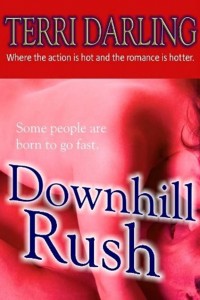
Downhill Rush is one title in a line of books from Fiero Press. Terri Darling is one of the authors who specializes in romance. If you look at the cover, the publisher has passed on a logo, but has used layout and color to show a common line of books. In this instance most of the Terri Darling books have a valentine-red border at the top with the author’s name and the tag line “Where the action is hot and the romance is hotter”, in a consistent, easy to read font that puts the author front and center . Does the tag line sound a little sexy and a lot hot? Does it tell a reader what they’ve got? With this memorable little tag line and the familiar look of these books, it won’t be a surprise if these books sell well once the author is established.

The Nara Effect is a Science Fiction book from Matthew Lieber Buchman. Matt has a line of books that cross genres, but there is a similar look to most of them, so you know you have a Buchman book. Across the books, the covers have a consistent upper and lower border with a consistent placement of the Author’s name and title. The central cover art section of the cover often uses a montage of images out of the book and the blurb usually is placed right at the top. Again the reader is going to know they have a Buchman book, and just to be certain of that, on the back of each novel Buchman has placed a knife, a Samurai Sword or some other sharp-bladed object diagonally across the back cover blurb. This is unique and memorable and I can see people describing them as ‘the knife book brand’.

The last of the books I’m examining comes from best-selling e-book Thriller author, Joshua Graham. His cover for Beyond Justice follows the tropes of many thrillers. It has the emphasis on name of a ‘big name’, best-selling author. It has the black band at the top for the author’s name to stand out in and the cover image is clean and simple with this cover focused on the primary character. This similar layout is present in many of his other publications, but the focus here is on NAME. He has made himself a brand, just as Clive Cussler, and James Patterson have made themselves brands, though not at their level yet.

So the look or brand is layout and font and logo and feel. This means that in establishing your brand it’s helpful to:

  1. Chose something that you can present consistently on the cover of your books. This could be a logo, a tag line or even the name of the Author.
  2. Consider whether your approach is to have a collage of images or a single strong image. This can be used consistently across all your books so that your Brand either has complex or minimalist covers, both of which are  used in ‘traditional’ publishing.
  3. Be consistent in format. If you are using bands of text, use the same type of band across all your books. If you use a specific font for your books and a brand is important, use that font consistently. If you are going to include a tag line or logo, position them consistently on the cover.
  4. Think about whether color can be used to show consistent branding.
  5. Think about how you are trying to position yourself or your books and your genre. If you are writing/publishing big thrillers, then use a thriller format for the covers. If you are writing/publishing epic fantasy, it will be something totally different, than if you are writing/publishing sweet romance. So go study the covers in your genre and see what you can come up with as cues for readers regarding your brand.

So creating a brand can include combinations of graphic elements that build a ‘look’. When you are creating your brand, try out various combinations to see what works best.

I’d be interested in seeing or hearing about what others are doing to establish their brand of books. Now I’d better go do some branding of my own.

Recent Fantasy

Available HERE,

$1.99

Available HERE,
$3.99

Available HERE $1.99


Recent Mystery


Available HERE
$4.99


Available HERE,

$4.99


Available HERE,

$4.99


Available HERE,
$4.99


Recent Romance

Available HERE, $2.99