Read an e-book week
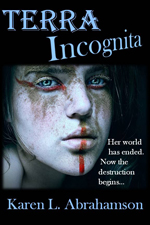 In celebration of read an e-book week all my novels, including the Cartos fantasy series, are 50% off on Smashwords. Happy reading.
 In celebration of read an e-book week all my novels, including the Cartos fantasy series, are 50% off on Smashwords. Happy reading.
Writing this series of posts about maps and map makers has brought home that people have been making maps or pictures of places for a very long time, but it has also brought home that what people were making and the reasons they were making them has changed dramatically over the centuries. This change in purpose has led academics to wonder whether maps really were as ubiquitous across human history and they suggest that maps as we know them today really only came into existence in the 15th or 16th century.
What do they base this upon?
First of all it’s the paucity of maps that have remained in existence from earlier times. Sure, time would have destroyed many maps, but surely more than the few we have would have survived, just as art and sculpture and manuscripts survived. Secondly, those ‘maps’ that have survived from earliest times, had purposes that were different than maps today. Some represented a way of seeing the world , for example, the T-O maps I wrote about here, were intended to show Jerusalem as the holy centre of the world. Another example are Mesoamerican maps that didn’t focus on spatial mapping, but instead presented ‘community maps’ that represented history and territory, something like a pictorial genealogy. Native American maps present something similar. Other early maps were diagrams of a monasteries and manors, and still others served as religious icons, mandalas, construction drawings, itineraries and so on. Different maps, different purposes, and definitely not the purpose we put maps to, today.
The proponents of the idea that maps as we know them began in the latter half of the second millennium, also point to how the current purpose of maps – namely representing space or relationships, or showing ownership, or pointing out how to get from point A to point B were purposes that had previously been accomplished using means other than maps for as long as there has been history. If people wanted to represent a place, there were paintings and art work. For relationships, there was genealogy. If they wanted to convey ownership, there was text to use, or numbers. And if they wanted to show how to get from point A to point B, well there was word of mouth or text. These had sufficed for centuries. Why did people need these things called maps?
The answer apparently came with the rise of the nation state in the 15th and 16th Century (and possibly as early as the 12th Century in China). As nations expanded, as military ventures demanded, the need for maps became more evident. Rulers such as Henry IV of France were advised that maps could convey an idea of his holdings better than words could. Other rulers such as the Hapsburg emperor Charles V lost vital battles for wont of a map of a strategic area. And this wasn’t just a European experience. In places like Japan there is little evidence of widespread use of national maps until 1591 when suddenly maps were commanded for all geopolitical areas, leading to a national map in the 1630s. And Japan isn’t alone: at the same time that Japanese and European mapmaking blossomed, similar mapmaking flourished in China, Thailand, Russia, Malaysia, Vietnam and the North American Colonies.
Yes, some of this flourishing may have been due to importation of mapmaking from one culture to another as international trade broadened, but academics suggest that the ease of the adoption of these skills speaks to the existence of similar map-making traditions that had sprung up independently across cultures at the same time. Why?
Map making appears to have proliferated in the new nation-states where it would otherwise be difficult for a central government to ‘know’ the length and breadth of their nation, suggesting maps brought local knowledge from the hinterlands into the center of government, where that knowledge could be used to the service of the central state. So modern maps themselves, just like the lines we draw on them, were an act of control – not just setting boundaries on the landscape, but also establishing boundaries around the people who dwelt there.
 This week I finished the second draft of book two in my post apocalyptic fantasy, Terra Incognita, series. It wasn’t easy because it required a fairly major rewrite of much of my major character’s attitudes and motivations because I hadn’t mapped my character out from book one to book three. As I get started on Book Three, I’m thinking about how the importance of a consistent road map across a series of books is just as important as a consistent map of the world.
My last post spoke of the work done to standardize measures in mapmaking that led to the creation of the scientific metric measuring system. But the creation of the metric system was only the start in a venture to create of a consistent set of maps of the world. This might not seem sexy, but think about traveling to a different locale and finding the maps you are using don’t use consistent measurements and contradict each other. You end doing a mass of translations to make the maps work or you might end up throwing the maps out because they are so inconsistent it’s easier to simply start from scratch. That was the situation for many explorers because the maps they had might have used a consistent measurement scale (but not always), but were also based on measurements started from different starting points. In other words the Prime Meridian had never been agreed upon.
After the agreement about the metric system, there were still disagreements in the cartographic world. One of the major ones was the position on the earth from which meridians (the imaginary lines drawn on the earth from pole to pole that connect all spots along the longitude) should be referenced – in other words where was the zero point on the globe from which all other distances would be measured. To this point in time, where measurements began depended upon the nationality of the scientist conducting the measurement.
The need for a Prime Meridian had existed for all Cartographers. Ptolemy had chosen the Fortunate Islands – at his time the westernmost extent of the world. But the age of politics had national sentiment taking precedent with the French recommending the zero point’s location in Paris, the Spanish recommending either Toledo or Cadiz, the Italian Pisa or Rome, and Americans wanting Washington or Philadelphia etc. It took the International Meridian Conference in 1884 to settle on Greenwich as the Prime Meridian which gave us our zero longitude, and also set our clocks and time zones with Greenwich Mean Time.
A later conference of the International Geographic Congress realized the mapping issues I mentioned above meant that there was a need to revise the world’s maps to create a consistent map of the world. It led to a proposal for an International Map of the World that would all be drawn to a single scale – 1:1,000,000 (1 centimeter =10 kilometers or 1 inch equals 15.78 miles) – leading to the name of the project being the Millionth Map. It would also be drawn using standardized symbols and colors. The project was debated for a period, but after examples of the maps were produced, in 1913 an agreement was reached. Maps were to be created for each 4 degrees of latitude and 6 degrees of longitude, not paying attention to national boundaries. All place names had to use the Roman alphabet.
It was a slow process. Between 1913 and the start of the First World War only eight maps were produced out of a total of 2,500 required to map the world. Between 1921 and 1946, the American Geological Survey produced the 107 maps that comprised the map of Hispanic American (North and South America). By the 1930s 405 maps had been produced in total, but the central repository of the maps (in Paris) was largely destroyed during the Second World War. In 1953, the United Nations assumed responsibility for oversight of the project, but by the 1980s only 800-1000 maps had been completed and many were not completed using exactly the same standards. Since then the U.N. has stopped even reporting on the project, so after all this work the Millionth Map languishes and who knows when you’ll fall right off its edges when you visit another country and have to work with maps that don’t mesh.
This suggests that I had better get busy and piece together the latitudes and longitudes of book three in my series, so that all of the books provide a complete and consistent picture of Terra’s world.
 Once upon a time there was a mapmaker who lived in the Northern hemisphere, and who from amongst the four cardinal directions, chose north as the primary direction at the top of the map. Not that it didn’t make sense. Men had taken their direction from the North Star for eons, but this was different than the religious maps that had existed until then, which often, at least for Christians, placed the east as the cardinal direction(as that was the direction of paradise). But this ancient mapmaker with his northern bent started a trend that has continued to this day. Our maps are oriented northward, and consequently they give primacy to the north.
For those of us who live in the north this doesn’t seem like an issue, but anthropologists and historians suggest that this emphasis on the north has colored how we think of the world. They posit that maps embody the interests of their creators and that emphasis on the north contributed to phenomena like African colonization, South American conquest, the Anglo-Indian Raj, and Orientalism, where northerners believed they had the god-given right to claim the land and ‘civilize’ the natives. Heck it wasn’t that long ago in human mapmaking history that we thought the south was populated by single footed beings who used their overlarge foot as shade against the killing southern sun. Anthropologists and historians propose that the northern cultures believed that they were the civilized nations. Therefore the south wasn’t, or so the story goes.
 There are those who say that the map structure itself with its focus on the north as at the top and the south at the bottom, created or embodied a thinking error that, in turn, created the sociopolitical situation in the world today with the north as the ‘have‘ nations and the south as ‘have nots.’
All this illustrates that maps hold power beyond the simple placement of landscape features. We use maps for illustrating far more than roads and mountains and political boundaries. Maps are used to present information about populations and this information has incredible power. Poverty. Number of people per square mile. Alcohol consumption. The owner to dog ratio. All of these things have been presented in maps and once they are presented this way, the knowledge of the poverty or population density or alcohol use or dog to person ratio becomes the reality of a particular location. The trouble is that often these informational maps focus the viewer on only one thing to the exclusion of all else.
Case in point is a series of maps of a community I’m working with. These maps show the vulnerabilities of a community’s population by neighbourhood. Policy makers and managers who view these maps want to focus all their resources on the neighbourhoods with the highest percentage vulnerability. Sound like the right thing to do?
Perhaps. But what if I told you that the neighbourhood with the highest vulnerability also has one of the smallest populations? What if I told you that the vulnerable population of another neighbourhood, while being a smaller percentage, actually far outnumbers the vulnerable population of the first neighbourhood in terms of actual people? What do you think then?
And if I told you that the first neighbourhood contains virtually all the community resources of the combined neighbourhoods, would you expect the policy makers and managers to rethink their resource allocation decision?
The trouble is this often doesn’t happen. Well-meaning people take the face value of a map and think it’s the truth, instead of looking at the layers of truth behind the map. Often these layers hold just as many faults as the map we are looking at, but failing to look leaves all the layers unquestioned. When this happens, these well-meaning people may propagate a thinking error that, though well-intended, has the potential to lead map readers astray, just like that ancient map-maker’s work.
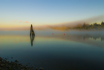
I fell off the map this week – at least that was what it felt like when I learned that I’d been removed from the intercom list at my townhouse complex. It doesn’t sound like much – a simple omission when they were doing the complex list – but think about it. To the outside world I no longer existed in this location. I inhabited an invisible place outside of the normal world that happened to be located between the house number below me and the one above – much like the safe house in Harry Potter but without the overt magic. I was gone, and so was my home and all the mementos I’ve collected from across the world. And of course my cats.
I’ve experienced something similar before, when I worked in the interior of British Columbia in a small town that was a long ways away from anywhere. When my agency’s reporting relationship shifted from one region to another, all the paperwork connections seemed to disappear and no one contacted us – it was actually quite a nice change. But it was also like we inhabited some huge fog bank that filled a space in the center of the province that no one knew existed. Our own personal twilight zone.
Such phenomena isn’t only in my imagination. Cartographers have been erasing or omitting bits of the landscape from their maps since before Prince Henry, when choice harbors and trade routes were secrets worth killing for. In order to gain a truer picture of the world, it became common practice for Kings to confiscate the log books and charts of each ship that came to harbor in order to copy them down before the sailors took ship again.
During the time of the early Portuguese spice trade, the location of, the Moluccas, the five tiny islands that were the sole source of nutmeg, mace and cloves, were closely guarded secrets. True maps of the eastern Indian Ocean were treated as highly classified documents (and few exist today) due to the possibility that the Portuguese were violating a Papal bull which gave the Spanish sovereignty over all lands west of a longitudinal line running 100 leagues west of the Cape Verde Islands (in the Atlantic).
During the age of exploration and when Spain, France and England were vying for the Americas and the Northwest Passage, maps were made that purposely misrepresented the landscape in case they fell into (and sometimes purposely intended for) the enemies’ hands. Such maps were intended to deter exploration by competitor nations because the harbor, the river, the inhabitable, productive land wasn’t there.
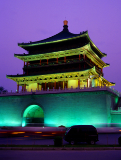
Even today we see maps shift reality so that places exist differently than what you would find ‘if you were on the ground’. Road maps often include streets that are planned, but have never been built, or don’t describe that the street crossing that looks so direct on the map, can’t be made. A recent internet report showed that Chinese government maps of cities often change the position of major streets. Why? For military purposes. The government has apparently fallen back on the ancient practice of redrawing reality to stop potential invasion or intelligence gathering.
Happily, I’ve been replaced on the list of existing residents of my complex and so my home and I have been returned to reality. There is no longer a fog where my house once stood and my cats and I are all okay.
 In my last blog I mentioned how in the middle ages religion turned back cartographic knowledge, so that people started to think the world was flat. Heck, maybe it was flat then, given the prevalence of the belief in Europe. Or maybe the Europeans lived on a flat earth while the rest of the world didn’t, but during that time religious maps placed a new world view in the forefront of European’s minds.
Some of the earliest maps, the ‘T-O maps’, from between 500 and 600 A.D. show a very different world than what we consider reality today. They were circular, disk-shaped maps (the O in T-O) that showed a circle of ocean around three continents that also made up a disk within the circle. At the top of the map was Asia that took up most of the top half of the circle. The bottom half was divided into Europe on the left and Africa on the right. Separating these three continents were the Mediterranean Sea (separating Europe and Africa), which was directly connected to the Don River and Nile River, which formed a horizontal margin across the middle of the map separating Asia from Europe and Africa. The confluence of the Mediterranean and the two rivers created the ‘T’ in the T-O map. The three continents were also each labeled and apportioned to the three sons of Noah, namely Shem, Japeth and Ham. The only further detail was the presence of Jerusalem at the heart of the world.
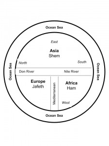 Not a particularly helpful map if you needed to find your way from point A to point B, but what it did was point the way to a different way of viewing the world. Asia was paramount and so was the east, which was also placed at the top. The north sat on the left. Why and what did this mean?
It reflected the belief that paradise lay somewhere off to the east and thus Asia was important.
Other maps of that time period, placed a square of land floating in an Ocean Sea that was filled by the four great rivers of paradise. So, for a while at least, these often beautiful maps were of no help to anyone travelling or exploring. But that wasn’t their intention. These maps were created to shape minds and belief systems, rather than to reflect reality.
Of course people still went on voyages from point A to point B, and stories from adventures like the ‘mythical’ voyage of Saint Brendan of Ireland, fueled additions to maps for many years. Saint Brendan believed (contrary to the T-O maps), that paradise was an island somewhere in the Atlantic and so he sailed away and returned with tales of great adventures and the discovering of an island of great beauty and fertility that came to be known as Saint Brendan’s Island. Given the way the island changed its placement on maps over the next 1200 years, clearly this was an island with an outboard motor, but as late as 1721, long after the Age of Exploration and the Renaissance had dawned, the Portuguese were still sending out expeditions to find Saint Brendan’s Island. They never did, and the paradise promised by Saint Brendan faded from the map.
But in my imagination, I wonder if the island really did exist — until someone decided to erase it from the map, sort of like an adult deciding a child is too old to beleive in Santa Claus. Maybe the island’s erasure was the point when Euopean’s grew up in the world. Or not…
Which, I suppose, points to the fact that the human spirit might hold to faith, but it also cannot be contained by the simple boundaries of a T-O map.
I never get lost, or only rarely. Few places turn me around, Portland Oregon being one of them. (I’m blaming the rivers and the volcanoes on creating a weird magnetic field that disturbs my sense of true north.) All my life I’ve arrived in a new place and managed to orient myself quickly, so that I’ve been able to get around with only my sense of direction and, when necessary, a map. These days, however, I’m beginning to feel like an anachronism every time I unfold my trusty, old fashioned paper map. In fact, I’m reminded of an episode of FRIENDS, when, in London, Joey had to place his map on the ground and step into it, in order to find himself.
Let’s face it, with GPS, Onboard computers in our cars, and smart phones, all of which will give you the best route to take from point A to point B courtesy of MapQuest, the art of map reading is certainly on the wane. Which makes me wonder what the loss of that art will mean to our world.
Sure it might mean less coffee-stained maps, probably fewer traffic accidents and certainly fewer arguments between couples lost on a Sunday drive, but what will it mean to how we see the world?
My fascination with maps has always existed. Travelling as I do, one of my first purchases for any destination is a map that is large enough that I can understand the relationship between places, and that I can see enough details so that I can also get off the beaten path. When I go travelling, I like to trace my route on the map as an indelible reminder of the places I’ve gone and the things I’ve seen. It also reminds of the immensity of experiences I haven’t had, and all the other corners and mountain tops and valleys and towns and people I haven’t seen or met. The map reminds me of the world out there that I’ve, ever so briefly, stepped into.
With the advent of GPS and TomTom etc. I wonder how that affects our relationship with the world around us. With a map we get context. We get how small we are in a much larger world, whereas the GPS and OnBoard Computers I’ve used reduce the world to one small computer screen that points us in one direction and that doesn’t foster those exciting tingles a map gives when you realize there’s an alternative route to the one you’d chosen—one that might be richer for the fact it isn’t the most direct route or the path that most people travel.
Maps have fostered my imagination since the first time one fell out of my parents’ National Geographic Magazine and since the first time I traveled with my parents from British Columbia to Quebec and my mom showed me a map of the continent. I was seven and the vastness of the landscape excited me with all the half-glimpsed things along our route. Maps gave me a sense of where we were in relation to where we’d been. Today they give me a sense of the greater world. Old maps show what the landscape once was and how it has changed. Maps even give a sense of how other cultures view the world differently than most North Americans do today
The French Author, Andre Gide wrote that “One does not discover new lands without consenting to lose sight of the shore for a long time.” That’s what maps are all about, a guide to discovery and exploring something vaster , whereas GPS seems to make a journey all about yourself moving from point A to point B.
So for me, though GPS and MapQuest are great for short trips, I’ll muddle through with a paper map and my own sense of adventure. I’ll live by Gide’s philosophy and take a chance on getting lost or perhaps, like Joey, finding myself in the map.
So how do you prefer to travel? Are you map challenged or a fan? Do you depend on GPS when you’re travelling? Why?